Tuesday, December 29, 2009

Commandos invade shops early

The end-of-year issues of D.C. Thomson's Commando have arrived in shops a couple of days early due to the holidays. Out now are the following four editions, with information kindly supplied by editor Calum Laird...

Commando No 4255 (previously No 2608 from 1992)

NEVER VOLUNTEER!

The Dakota droned away and the canopy cracked fully open above Bob Slade, a private in the Parachute Regiment. He adjusted his rigging lines and took a quick glance at the barren desert wastes below.

Unlike his mates descending all around him, Bob had been here in North Africa before — as a soldier in the French Foreign Legion, charged with the murder of an officer. And he knew as well as every other Legionnaire that the Legion never forgets…nor forgives!

Story: Cyril Walker

Art and cover art: Ibanez


Commando No 4256 (previously No 2618 from 1992)

BATTLING RUST-BUCKET!

The Duchess of Alna was a pleasure boat by trade, more suited to ferrying holiday-makers than going to war. Yet that’s exactly what she had done in 1940, as one of the heroic “Little Boats” of the Dunkirk Evacuation.

And now, more than fifty years later, when some said that she was only fit for scrap, this unlikely battleship was off to the rescue again — slap in the middle of a war-zone!

Story: Ian Clark

Art: Gordon Livingstone

Cover: Jeff Bevan

Gordon and Jeff were both staff artists. Jeff’s stuff was seen throughout the Boys’ Papers but Gordon was almost exclusively Commando. On average he took 4 weeks to illustrate a complete book.

The two new stories are both set in the Ardennes as it was 65 years ago this month that the Battle of the Bulge was fought there. The Winter Warriors is the last new book drawn by the late Ricardo Garijo, completed before Need To Know but held over for the Ardennes connection.


Commando No 4257

THE WINTER WARRIORS

The Ardennes, December 1944. In the murderous confusion of what became known as “The Battle Of The Bulge”, Allied soldiers warily stalked the frozen wastes and eerie forests of the battlefield, aware that at any moment they could be cut down by enemy gunfire. Not to mention marauding Nazi panzers or the terrors of hidden minefields.

For a squad of rookie American GIs it was going to take all their wits and courage to stay alive…

Story: Ferg Handley

Art Ricardo Garijo

Cover: Ian Kennedy


Commando No 4258

The second Ardennes-themed story

Friends Or Foes?

When the Germans launched their Ardennes offensive — the desperate last-ditch “Battle Of The Bulge” — in December 1944, they sewed seeds of confusion amongst their enemies by using special units dressed in Allied uniform.

Royal Engineer Sergeant Bob Ashford wasn’t the only one who couldn’t tell friend from foe. Nor was he the only one who decided to shoot first and ask questions later.

Story: Peter Grehan

Art and cover art: John Ridgway


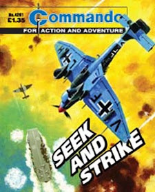
Calum has also supplied an advance look at one of next month's issues, with the following info: "We’ll be starting the year by re-issuing the first book featuring an Ian Kennedy cover by way of thanking the man for 40 years of sterling service to Commando. The book is No 453 from... 1970... And is titled Seek and Strike".


Monday, December 28, 2009

Vintage colour comics: GOLDEN No.125 (1940)


When one sees articles on the British pre-war and wartime comics, with their simple format of black ink on coloured paper, it's easy to forget that there were also some comics that had full colour covers. Dandy and Beano were not the leaders in that field as sometimes thought, as we'll see with this occasional look back at some of the colour comics from Amalgamated Press.

This issue of Golden, dated March 9th 1940, shows the weekly towards the end of its short life. The comic only ran for 135 issues, and this is issue No.125.

Originally, Golden had started out as a comic printed in black ink on orange paper, then switched to two-colour printing (black and orange on white paper) before upgrading to a full colour cover with issue No.116. It seems that A.P. tried everything they could to attract readers before its merger into Jingles in May 1940.

Why did it fail? The easy answer is wartime shortages probably killed it off and it would have been a relatively expensive comic to produce, so merging it with a cheaper quality comic may have been the best option. A great pity, as Golden would have certainly stood out in newsagents, as this bright and lively Roy Wilson cover demonstrates. (Readers of Alan Moore's new Dodgem Logic magazine will perhaps have noticed that this is the comic that inspired the masthead for Alan's first issue.)

The cover is busy and well designed, with the Golden Picture Palace side strip being a nice bonus alongside the main Lieutenant Daring strip. Daring was a character that had started out on the front cover of Sparkler comic, but A.P. moved him to Golden from the first issue, I assume to try and attract Sparkler's readers to the new comic.


Even to this day Roy Wilson remains one of the most influential humour artists to ever grace British comics. However, to my eye, the semi-realistic style used for Lieutenant Daring himself seems to clash with the bouncy inkline of the supporting characters. This is particularly evident when extreme caricatures (such as the cannibals in this strip above) appear in the same world as the perfect mannequin features of Daring.

Inside the 8 page comic, there's a traditional mixture of text stories and comic strips. However the tone of Golden was slightly younger than that of most other A.P. comics of the time. It seems that Golden was created to bridge the gap between nursery comics such as Rainbow and comics for an older age such as Comic Cuts.

Time for a cheap laugh. Yes, this character's name is funnier than his story...

Other than the cover, there aren't any slapstick strips in the comic. Golden was trying to be a light adventure title rather than an out-and-out "funny". The few humour strips in the comic are quite gentle, and, well, not exactly comedy classics, as shown by this extract from Brother Bill and Sister Sue...


Harbour Pirates is a simple but solidly drawn serial showing plucky youngsters having exciting and dangerous adventures, - the sort of theme that rivals D.C. Thomson would excel at for decades.


For me, Kings of the Air is the standout strip in the comic. The artist is Reg Perrott, a huge talent in adventure strips of the era whose style was far ahead of many of his contemporaries. Sadly Reg died in 1947, before British all-adventure comics really took off, but what a great addition he would have been to comics such as Eagle.


On the back page of this issue is Kaloo, King of the Tigers, an obvious Tarzan copy even down to the logo design. Artwork is by Arthur Mansbridge, father of Norman Mansbridge the humour artist responsible for Fuss Pott and Mummy's Boy in the IPC weeklies.


The war certainly damaged Golden's chances of success but I'm sure that wasn't the only reason for its short run. One would think that a comic featuring talents as strong as Roy Wilson and Reg Perrott, with a full colour cover, would be bound to succeed, - but the appetites of readers aren't always easy to judge. Perhaps the younger tone of Golden was to its disadvantage? Perhaps the more value-for-money (and funnier) Dandy and Beano were just too strong for Golden to compete with?

There'll be a look back at another vintage colour comic soon.

Friday, December 25, 2009

75 Christmases ago, the first Funny Wonder Annual


It's December 25th 1934. In stockings and pillowslips across the UK, nestled between the oranges and monkey nuts, is the Funny Wonder Annual 1935, which although was far from being the first children's annual was the first such book devoted to the long-running comic from Amalgamated Press.

Children must have been overjoyed by this book. The Funny Wonder weekly consisted of just 8 pages, black ink on blue/green paper, but this Annual had a whopping 108 pages on paper as stiff as card, with some pages in full colour, all within a hardback cover.

And what a cover! AP's finest artist, Roy Wilson provides a painting of his popular characters Pitch and Toss and their Captain, looking on as the animals of the jungle scoff the contents of their picnic hamper.

Another treat from Wilson's brush greeted the reader inside the book in the form of a full colour plate showing a great slapstick sequence which, unlike the cover, was an appropriately seasonal winter scene.


Following that was an introductory letter from The Editor welcoming readers to the book (and managing to plug the weekly comic while he was at it). The stories then began, starting with a traditional Christmas mystery story.


Board games were often a tradition of annuals and the Funny Wonder Annual served up an appropriate page for the era, Air Raiders.


Roy Wilson was back again for a marvelous four page Pitch and Toss strip in full colour. Sadly the racial stereotypes of the era blight the story (in this case it's a dig at the Chinese) but that was the way comics were back then.


The rest of the book continued with this lively mixture featuring many text stories, comic strip, and short items of interest. Old favourite Charlie Chaplin was there...


...as were tales of exotic lands in stories such as The Snake Charmer's Revenge...


...and this humour-adventure strip Frolics and Fun with Mustava Bunn (artwork by Reg Parlett I think)...


...a busy self-contained page of typical British comic fun with hilarious consequences...


...and a strip called Pranks in the Park which features "The Prying Priors", one of which seems to be a precursor to Thomson's Keyhole Kate who would arrive in the new rival comic The Dandy three years later...


Even robots got into the act, in the shape of The Automatic Man, which must have seemed very modern and exciting to kids of 1934.


The annual was priced 2/6d (12 and a half pence) which was a huge leap from the 1d weekly, but unlike the throwaway comics this was a book to treasure and one that would have entertained its readers throughout the holiday. On the back cover was an advert for five of the AP weeklies of the period. Strangely, Illusrtated Chips, Comic Cuts and others were excluded, but seemingly the idea was to promote one comic a day over five days. It's doubtful that most kids of the Thirties would receive as much as 5d pocket money a week, but if they couldn't afford all five comics at least this ad gives them a choice.


This debut Funny Wonder Annual was presumably a success as it would continue for another six years before World War 2 put paid to it. Some of the other AP titles would also receive annual editions and of course the tradition continues right up to the present day.

I hope you've enjoyed the recent Christmas comics blogs. Blimey! has now been running for three years so I thank you all for visiting and reading these blogs and hope you'll continue to drop by in the months to come. Merry Christmas Chums!

Wednesday, December 23, 2009

Christmas comics: Funny Wonder / Joker 1934


Our final destination on this festive journey into the past history of comics brings us to 1934 and this time, two vintage British comics that were published 75 years ago this week.

First up, The Funny Wonder No.1,083. Don't let the "Funny Wonder and Jester" logo deceive you, - this isn't a merged title. This is the overseas edition, exactly the same as the UK Funny Wonder except for the logo. When Amalgamated Press exported their comics overseas some of them were packaged as two-in-one comics, so in this case The Funny Wonder was sold in Canada with that week's copy of The Jester inside it, hence the boast of "Sixteen Big Pages Every Week". This practice continued for overseas editions until 1940.

Sadly it means that this edition of The Funny Wonder is without its special Christmas logo that would have adorned the UK cover, but other than that it's entirely identical to the British edition. (The interior copy of The Jester has unfortunately been lost in the time stream.)


On the cover, comical sailors Pitch and Toss and their Captain have a lively fun-packed romp with artwork by Reg Parlett "ghosting" Roy Wilson. The final panel and its inevitable slap-up feed (shown in detail at the top of this blog entry) displays a marvelous range of expressions just in one scene.

Inside there's a mixture of 50% text stories and 50% comic strip, as was the standard format of comics from Amalgamated Press. Funny Wonder and its companion comics were in their prime during this period, dominating the stands in the years before Dandy and Beano arrived.

Resident fictional office boy "Pimple" tells a tale featuring a typical black stereotype of the period. Such narrow-minded depictions of black people were numerous in comics of the time, as indeed they were in films and music hall back then. No doubt some of the authors were bigots, but for the most part any offense was unintentional and naive rather than vindictive.


Across the middle pages of the issue, (printed in dark blue ink) a smattering of short strips, with Charlie Chaplin at the centre. The story follows a pattern repeated countless times in comics of this era: poor hero (in this case Charlie) inadvertently foils bully / robber and grateful wealthy character rewards hero with "crisp ten-pound note" which hero spends on a big meal in a posh restaurant. Artwork by Bertie Brown.


The Marmaduke and His Ma strip (drawn by Wally Robertson) is interesting in that it assumes the reader knows that "Santa" is really a parent who brings in the gifts. Indeed, most kids who were old enough to read such comics would already know this, but in later decades the illusion of Santa was usually maintained in children's comics.


Grandad Jones - The Youth with Old Bones is the sort of "youthful grandad" character that would later resurface in The Beano's Grandpa. Speaking of which, you'll note that this strip (and many others of the period) prove that speech balloons and text-less strips were firmly in place before Dandy and Beano were launched, despite some media academics claiming otherwise.


British comics always championed the poor and downtrodden and Milly - The Merry Maid of All Work gave readers a female hero to root for. Artwork by Reg Parlett.


Adventure strip serials usually rounded off these eight-page tabloids and on the rear of Funny Wonder in December 1934 was The Sacred Eye of Satpura, with detective Clive Munro battling crooks in China. Artwork by George Heath, who also illustrated The Falcon for Radio Fun (see previous blog).


Tucked away in a corner of the comic was an ad for the Christmas issue of Larks. No bold half page announcement as titles receive today, just a postage-stamp-sized plug for a companion comic (enlarged here).


Another A.P. comic out that very same week in 1934 was the Christmas issue of The Joker. I showed this cover last year, with its Alfie the Air Tramp strip by John L. Jukes, but now let's take a look inside...


Two text stories lead off the contents of Joker, with A Christmas Mystery and Sea Secret (featuring regular hero Paul Service) both having seasonal themes.


On page four, Maurice and Mick, Ye Merrie Minstrels. The concept of two pals, one thin, one fat, wandering the land and getting into scrapes, had been a common theme in British funnies since their 19th Century beginnings (eg: Weary Willie and Tired Tim in Chips). In its most popular pairing the concept would of course transfer to cinema with Laurel and Hardy.


Midge and Moocher often featured scenes that simply couldn't be published in a children's comic today. This Christmas episode begins with a dog being pushed up a chimney and ends with a baby smoking a pipe. Parents today would have a fit if they saw that in a comic.


Characters in these vintage comics usually ended up in better circumstances than they were in at the start of the strip, - and all within half a dozen panels or so. In Chimp and the Imp, our heroes show resourcefulness to lift them out of their situation. Clearly such tales were intended to inspire readers to be self sufficient, just as the other common theme, the reward-for-good-deed plot, was intended to encourage selflessness.


For several weeks leading up to Christmas both Funny Wonder and The Joker had been carrying small ads for the very first Funny Wonder Annual. Although children's annuals were already established none had been awarded to A.P.'s "funnies" until now... and I'll be taking a look at this rare book here on this blog in an entry scheduled for Christmas Day! If you have time, drop in!

Monday, December 21, 2009

Christmas comics: Radio Fun 1947


Hurtling further into the comics time vortex we arrive at Christmas 1947 and the festive issue of Amalgamated Press' Radio Fun is here. One of the more contemporary comics that A.P. launched to rival Thomson's Dandy and Beano, Radio Fun ran from 1938 to 1961 and merged into Buster.

I'll be taking a more detailed look at Radio Fun in 2010 but for today let's leaf through a few pages of this particular issue. The cover character of this period was Tommy Handley, star of ITMA (It's That Man Again), a very popular radio show that spanned 300 episodes from 1939 to 1949. ITMA created several catchphrases, some of which have become so ingrained in the national consciousness that most people who use them today wouldn't even know where they originated from. Case in point: panel five, with Colonel Humphrey Chinstrap's "Don't mind if I do", and the final panel with Mona Lott's "It's being so cheerful as keeps me going".

The artwork for this cover is, I believe, by Swedish born Alex Akerbladh, who also drew the early episodes of Issy Bonn and the Finkelfeffer Family (below) for the same issue. On the facing page is a text story adventure of Petula Clark, - complete fiction of course, but readers were expected to believe it.


Stretching credibility even further were stories "from the pen of the famous star of radio, Vera Lynn". In truth, the stories were undoubtedly the work of an anonymous freelancer or staff writer, but adding a celebrity's name to the header was all part of the glamour of Radio Fun.


In his Christmas episode Northern comedian Wilfred Pickles indulged in some traditional British comic festive hi-jinks by kicking a fat bloke into an oven. The inevitable promise of a slap-up feed concluded the tale, or as Wilfred put it "a reet slap up Christmas go". Artwork is, I think, by A.P.'s finest, Roy Wilson.


Reg Parlett provides a nice Arthur Askey strip for the issue. The plot about the man's infidelity (albeit just an innocent stolen kiss) was the kind of situation that showed Radio Fun was aimed at a slightly wider age range than A.P.'s successors, Fleetway, IPC, and Egmont, would pitch their comics at.


The Jimmy Jewell and Ben Warris strip uses a plot about a Christmas tree that I imagine was old even then! According to Denis Gifford's old ACE newsletter the artwork is by Reg Parlett, but I'm not so sure. Can anyone confirm?


The strip beneath it features Charles Cole and his Magic Chalks, - an obvious precursor to IPC's Chalky. I have to admit I sometimes find the work of Roy Wilson and his imitators hard to distinguish but I think this is by Wilson.

Detective stories were always a popular theme in British comics and this issue of Radio Fun featured a complete seasonal thriller with Inspector Stanley and The Shadow on the Wall.


Rounding out the 12 page issue, on the back page, was the very popular series The Falcon. The dark tense artwork is by George Heath, father of Private Eye cartoonist Michael Heath, and grandfather to 1980s Marvel UK staff colourist of Combat Colin, Sophie Heath!


Back in time again with another Christmas comic soon, chums!

Saturday, December 19, 2009

Christmas comics: Smash! 1968


Today's journey back in time brings us to Christmas 1968, where the Sixties were still swinging and Smash! was still published by Odhams. Having absorbed what was left of the other "Power Comics", Smash! incorporating Fantastic was the sole survivor, and even the mighty fist of the Power Comics logo had disappeared from the cover as 1968 drew to a close.

Mike Lacey's Swots and Blots strip leads off the comic. In a few months time Leo Baxendale would totally revamp the strip (see an example in yesterday's blog) but for now Mike's pleasant and energetic style dominates.

Inside, the variety line up of humour, British adventure strips, and American reprint made the comic a lively package. Although references to the Season are mostly absent from the adventure strips, wrestling serial King of the Ring manages to force a mention into the script.


The Odhams' comics were always good at getting reader feedback on the stories, as this letter's section above shows. By imitating Marvel's method from the USA, editors Alf and Cos (Alf Wallace and Albert Cosser) adopted a pally down to Earth attitude with their readers.

You'll also notice a small ad for that perennial favourite game, Subbuteo, with 1968 prices starting from 10/11d (54 and a half pence).

One of the most popular Smash! strips was The Cloak and in this issue our hero has a showdown with returning enemy Deathshead. Creator Mike Higgs even manages to end the episode with a festive message featuring a cast of, well, dozens. See how many characters you can identify in the background of the final panel! (As some of you didn't realise, I should mention that if you click on the images you'll see them much larger.)


Marvel reprints were a cheaper way to fill pages than using 100 percent origination, but they always divided the readership. Personally I thought they were great, particularly quality material like Stan Lee and Jack Kirby's Fantastic Four even when cropped and re-edited to fit the larger UK page size.


Bad Penny had been originated by Leo Baxendale for the early issues of Smash! and although other hands tackled the strip at times this seasonal episode was by Leo.


An all-Mike Brown effort is this Wiz War page, featuring Wizard Prang and Demon Druid continuing their rivalry even through Christmas.


Ken Reid's comic genius continues in its pre-IPC unrestrained glory with this spectacular Nervs double pager. Hapless Fatty once again falls victim to Ken Reid's dark humour, - and the result is sheer brilliance. Scenes such as Fatty gleefully swallowing toys out of crackers would be one of the reasons IPC were so aghast at the strip, forbidding it to ever resurface in their new line of comics.


One strip that IPC did later revive was Terry Bave's Sammy Shrink. This innocent fun strip began life in Wham! then moved to Pow! and then Smash! due to mergers. Always popular, it was brought back for new stories (again by Bave) in IPC's Knockout, and moved to Whizzer and Chips for a very long run.


Another popular strip was Percy's Pets, which had run in Smash! since issue one. Several artists worked on the strip but most were drawn by Stan McMurtry (aka Mac) such as the example shown here.


Odhams had some offbeat adventure strips, and The Spectre was a short-lived series that ran in the back of the comic. Believed to be dead but secretly living under a cemetery and emerging to fight crime, The Spectre was clearly inspired by Will Eisner's The Spirit in conception, if not in art.


I'll be delving further into the past for another Christmas comic soon!