Most comics of the time were printed on cheap newsprint, where the only colour would be added by the art department as basic flats due to the limitations of the printing method. However, Jag had the luxury of web offset printing by Steel Bros. of Carlisle, which meant that artists could colour their own work with an unlimited palette to suit the superior paper and printing. For most of its short run, Jag was also a big tabloid comic, so the artwork really stood out.
Here's the second episode of Football Family Robinson, from Jag dated 3rd August 1968...
...and episode three from Jag dated 10th August 1968...
Sadly, Jag didn't last, and when IPC took control they merged it into Tiger in 1969. Joe Colquhoun continued on the artwork though, with the strip now running as a centre spread every week. This episode is from Tiger and Jag 17th May 1969...
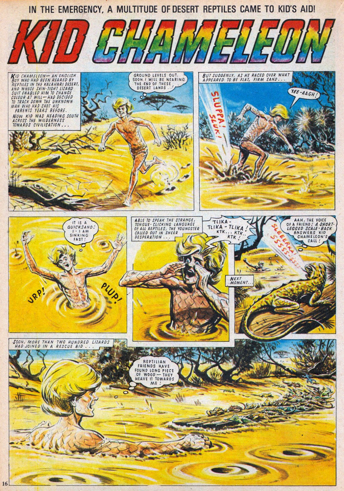
IPC tended to shift artists around at times and by late 1969 Joe Coloquhoun had been replaced on Football Family Robinson by John Gillatt. (Colquhoun was put onto a new Tiger strip, Splash Gorton, in black and white.) However, in 1970 IPC's new humour comic Cor!! was launched, which initially featured an adventure strip in its centre pages; Kid Chameleon. The strip was illustrated by Joe Colquhoun in full colour.
I'm not entirely convinced that episode one of Kid Chameleon was coloured by Joe as it doesn't look like his technique, but anyway here are the first three episodes of the strip from Cor!! Nos.1 to 3, dated 6th, 13th, and 20th June 1970...
Truly a brilliant artist!


Lew
ReplyDeleteGiven that Jag was a big tabloid format comic was Colquhoun's original work in similar size or were there adjustments between the art work and the print copy ?
Salutations from Detroit
I would imagine it'd still be drawn larger than published size. It was unlikely back then for artists to draw 'same size' but, yeah, the originals must have been massive.
ReplyDeleteNice piece. I have all of the Tabloids, and the art really stands out. Such a pity that so little of his artwork and Mike Westerns too, it available in print, IMO two of the best artist to ever work in British comics.
ReplyDeleteI recently got a handful of Mask comics where Colquhoun did his last artwork. IIRC Pat Mills offered Slaine to Colguhoun.
Fascinating to read of your misgivings on the colouring, an artist eye!
That's the thing, isn't it? It's SO difficult to draw SMALL! I know, as I've tried it myself with my own amateurish efforts.
ReplyDeleteAnyway, really interesting post, Lew. Wouldn't mind seeing a Part 2 sometime, featuring some examples of Joe's B&W strips.
I never did get a Jag, ( all my pocket money was going on Power comics and US comics at that time!)Was it a glossy tabloid, like Eagle & TV21. It's difficult to tell with the white background?
No John, Jag was on matt paper. Very nice quality, so probably an expensive production. It switched to smaller standard size several weeks before it merged into Tiger.
ReplyDeleteRe: Mask, I had those issues but threw them out. I have far too many comics and books as it is so something had to go.
I loved Joe Colquhouns art and especially Footbal Family Robinson's ( I've seen panel 4 of the first stip you published here) so many times in insert adverts in IPC/Fleetway comics for Jag. good to see it in context. I also never bought JAG when it came out (limitd comic funds) but my pal bought it so I read that - I recently picked up 2 early copies of Jag pre Football Family Robinsons inclusions and have to say that whilst it had some nice strips ( the Indestructible man - lovely art) I thought it was a bit dry in places - I think it got better as it went on though as recall Tom Kerr art (love his stuff so underrated or maybe that's forgotten) and some coo; adventure type strips
ReplyDeleteI think Jag was trying to compete with Odhams' Eagle but its standard of art was a bit higher than its scripts I think. (Something typical of many UK comics over the years.) Jag had some top artists working for it but perhaps because it only had 16 pages the weaker strips stood out more. I could have done with more of The Indestructible Man and less of 'Thunder Bill' or 'Snob College'. I'll show some more Jag pages at a later date. Tom Kerr's 'Boy Bandit' was very nicely drawn. (Bit of an unfortunate name in this day and age though!)
ReplyDelete