NOTE: Blimey! is no longer being updated. Please visit http://lewstringercomics.blogspot.com for the latest updates about my comics work.
Showing posts with label George Parlett. Show all posts

Wednesday, October 24, 2018

Basil and Bert vs 'Ateful Adolf (1940)

Children's comics of the wartime period often tried to raise the spirits of their readers by poking fun at Hitler and his cronies. Such was the case with this example from The Jester No.1998, dated February 24th 1940. Basil and Bert were private detectives created by Don Newhouse and Roy Wilson, although by the time this strip appeared I believe the art was by George Parlett. (Source: Encyclopedia of Comic Characters by Denis Gifford, 1987.)

This was part of a series of self-contained adventures of Basil and Bert in 'Nastyland' encountering 'General Snoring' (a parody of Goering) and 'Ateful Adolph. Hopefully, showing the vile Nazis as complete buffoons helped the readers cope a little better with the hardships of the times. Maybe it's also the best way to deal with the Nazis of today, - to portray them as the complete losers they truly are. 

The Jester was published by The Amalgamated Press from February 1924 to May 1940, and merged into The Funny Wonder. Today, it's one of the titles recently bought by Rebellion Publishing. 

Saturday, January 14, 2017

The BIG ONE merges into BUSTER (1965)

The Big One was a comic published by Fleetway from 17th October 1964 to 20th February 1965. A very short run, perhaps partly due to its cumbersome size, as the comic was a huge broadsheet format, far bigger than the tabloid-sized Topper and Beezer it was competing against. Perhaps another factor in its failure was that it was almost entirely filled with reprints. Now, its target group may have been too young to have read the stories before, but they may have found them too old fashioned. 

What may have really stuck the boot in though was that, as I understand it, the popular TV news / consumer programme On The Braden Beat did an item about The Big One, exposing it as a reprint comic. Something that may have led parents to believe they were being ripped off. 

Whatever the reasons for its downfall, The Big One didn't make a big impact and merged into Buster with the issue dated 27th February 1965. The cover of that first merged issue (above) is by Angel Nadal. 

Inside, the combined forces of Buster and The Big One had the unfortunate aspect of bringing in several reprints from the failed title, but Buster's own strips were strong enough to balance things. Here's the episode of Maxwell Hawke and the Phantom Zombie from that issue, drawn by Eric Bradbury...


The Micky the Mimic strip was a reprint of Hi-Fi Sid from Radio Fun.

At this period in time, publishers were still smarting from the anti-horror comics campaign of the 1950s. They were no longer allowed to publish horror comics as such, but they knew that kids loved such stuff. It seems to me that the compromise was to have a lot of dark, spooky material tucked away inside comics such as Buster, as you saw from the Maxwell Hawke strip. This air of shadowy menace was also evident in the new series, Toys of Doom, superbly drawn by Solano Lopez...

There was lightness amongsty the gloom too of course; a balance which was Buster's strength. The centre pages featured a variety of (reprint) humour strips from The Big One, including Tough Tex, a 1950s reprint from Comet by George Parlett.

Not all the adventure strips were grim either. Sweeny's Swingsters was Fleetway's attempts to relate to the pop fans of the day. I don't think they quite got it. Art by Mario Capaldi. It only lasted until May of that year.

On the back page, Charlie Drake, based on the TV star, with art by Arthur Martin...

It's worth noting that at this time, Buster was still a large format comic. Not as huge as The Big One had been, but the same size as a tabloid newspaper such as the Daily Mirror. It would reduce in size in October 1965, but gain twice as many pages. 

Sunday, July 31, 2016

JINGLES No.525 (1947)

It has to be said that, even for 1947, Jingles was looking quite old fashioned in its design and tone, compared to its lively rivals Dandy and Beano. The format of Jingles was the same that the publishers (Amalgamated Press) had been using since the end of the 19th Century; 8 tabloid pages with an equal balance of strips and text stories. However, at least Jingles had full colour on its front cover; something lacking in most of its sister papers from A.P.

Jingles had been launched in January 1934. According to the late Denis Gifford, "Jingles was the first AP experiment in upgrading their penny comics to appeal to middle-class readers and their parents. It was their first two-colour penny comic, and its immediate success led to the publication of a companion comic, Tiptop. Golden followed, and shortly the traditional penny comics, Chips and Comic Cuts, also went into two colours, as did Jolly Comic." 

Although its cover was printed in two colours for the first six years, Jingles upgraded to full colour covers in 1940. However, wartime paper shortages also caused it to change from weekly to fortnightly that year too. A frequency that lasted until 1952. Jingles ended in 1954, merging into T.V. Fun.

Here are a few examples from issue No.525, dated September 20th 1947. The Dreamy Dennis strip on the cover above is drawn by Albert Pease, using the old daydream theme with funny results.

On page 5, Strongheart, The Wonder Dog of the Woods, drawn by Hilda Boswell, one of the few women artists working in British comics back then. (More information at Steve Holland's Bear Alley blog here:
http://bearalley.blogspot.co.uk/2006/11/hilda-boswell.html)

Beneath the Strongheart strip was Jolly Jingles, by George Parlett...

On page 6, Little Jim Jolly and his Magic Brolly, drawn by George's brother, Reg Parlett. After which, a text story Twilight Tales, as a cautionary anti-bullying tale...

On page 8, the back page, a complete adventure story, My Big Thrill. Unusually for AP, it credits an artist, Tony Brent, unless that's a pseudonym...


Sunday, June 12, 2016

The Parlett brothers in 1939

Reg Parlett and his brother George both followed in the footsteps of their father, Harry, to work as artists in the UK comics business. The Parletts were very prolific and as most of you know, Reg Parlett was still drawing for Buster in his 80s. Here's some of their earlier work, starting with the cover of Radio Fun No.29 (April 29th 1939) by Reg Parlett.

Inside that same issue, Reg also drew the Revnell and West strip...
...while a few pages on, George Parlett illustrated (and lettered) Radio Fun Music Hall...

I've shown a lot of the Parlett brothers' work here before of course, but you can never have too much of a good thing. The fluidity of their brushwork and the liveliness of their characters made each page a joy to behold. Two fantastic cartoonists who brought smiles to countless readers over the decades.

Thursday, February 13, 2014

Radio Fun's first revamp


Comics often have various revamps and new looks over their long runs, and Radio Fun was certainly no exception. Yet it's first revamp came just a few weeks into its 23 year run. 

When Radio Fun was launched in 1938 its cover star was George the Jolly Gee-Gee, drawn by Amalgamated Press' top humourist Roy Wilson. Presumably George was on the cover because Radio Fun's rivals Dandy and Beano had animal characters on their covers. However, it seems editor Stanley Gooch soon had misgivings about this, thinking that a comic called Radio Fun ought to have something connected with radio on the front page. 

Therefore, with issue 18, dated February 11th 1939, Radio Fun had a mini-revamp, with a new logo, a free gift, and a new cover star, - Big Hearted Arthur, drawn by Reg Parlett. The character was of course Arthur Askey, who had previously had a strip inside the comic, but Arthur was very popular in 1939 and deserved his cover slot.

Inside the 28 page comic, the set-up had a few tweaks. George the Jolly Gee-Gee was relegated to a black and white half pager. I'm not even sure if this one was drawn by Roy Wilson as it's not up to his usual standard, but perhaps the sudden switch to a different format had required it to be drawn quickly.


Flanagan and Allen, previously in black and white, was now promoted to the centre pages and given a splash of red spot colour. The artwork was by Alex Akerbladh. Bud Flanagan and Chesney Allen's success on the stage, screen, and radio would continue throughout the war years, so they were ideal stars for Radio Fun. Here's a Pathé newsreel clip of them from 1941:
http://www.britishpathe.com/video/flanagan-and-allen-underneath-the-arches


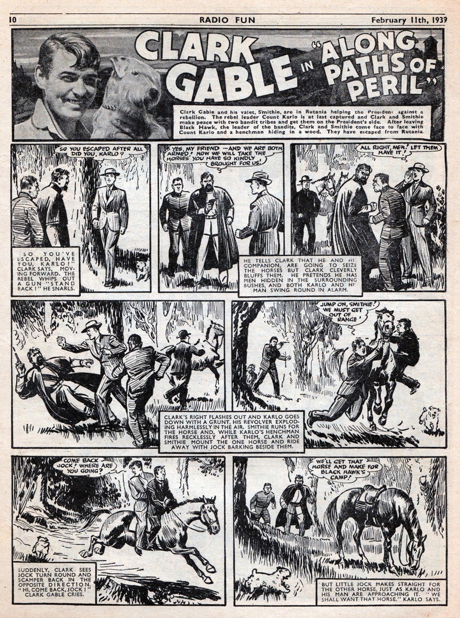
The rest of the comic carried on unchanged, with its mixture of prose stories and comic strips. Despite its title, Radio Fun never limited itself solely to radio stars. Here's Clark Gable in the latest installment of Along Paths of Peril drawn by George Heath.


Another big UK star of the time was Sandy Powell. Like many performers of the time he'd begun his career in the music halls. By the 1930s his radio career was underway, and his catchphrase "Can you hear me, mother?" became famous across the land. (Some people still use it today!) The comic strip in Radio Fun was drawn by George Parlett, brother of cover artist Reg.


George Parlett also illustrated the two page Radio Fun Music Hall serial. I know I've shown one of these on this blog before but it's such a great strip it's worth showing another. The layout of the pages, mixing art and rhyme, are quite unique and ahead of their time. 


I mentioned that this issue contained a free gift. Here it is, - the Radio Fun Bumper Song Book; a 28 page giveaway featuring the sheet music to "20 latest hits" such as London is Saying Good Night, I'm Knitting a Singlet for Cecil, and When Granny Wore Her Crinoline. 


Those songs are mostly lost to the mists of time by now, but here's a couple if you're curious...


There was also a free gift scheduled for the following week in the form of 'Magic Spectacles' and 'Living Pictures' that "spring to life before your eyes". I'm assuming they were an early form of 3-D specs. 


Radio Fun was a worthy rival to DC Thomson's comics. I have a good selection of issues from over the years and I think if I'd been around back then it would definitely have been one comic I'd have plonked down my 2d every week for. 

(As always, click on each page to see it larger. You may then need to click again to see it even bigger.)

Friday, October 26, 2012

This week in 1938: RADIO FUN No.3

 
You've seen samples of Radio Fun on this blog from the 1940s and 1950s but here's a few pages from No.3, the earliest edition in my collection, which was on sale exactly 74 years ago this week, in October 1938.

In these early issues, Radio Fun had a bright full colour cover. Sadly WW2 put paid to that and printing limitations confined it to red spot colour for the rest of its long run. Here though is an eye-catching full colour cover where publishers Amalgamated Press are clearly trying to emulate the style of their rival comics Dandy and Beano. Like their rivals, Radio Fun even had an animal star on the cover, even though it had nothing to do with radio! However, despite lovely artwork by Roy Wilson, George the Jolly Gee-Gee was no Korky the Cat. By issue 18 (seen here) the nag was relegated inside the comic, whilst Big Hearted Arthur (Askey) was promoted to a more fitting position on the cover. 

Like its DC Thomson rivals, Radio Fun had 28 pages in this pre-war era. The contents were evenly divided between comic strip and prose stories. Variety act Flanagan and Allen were the stars of the first strip inside the comic. Artwork by veteran illustrator Alex Akerbladh, a Swedish born artist who had been working for AP comics since 1909. 


That master of comic strip slapstick Reg Parlett was on top form drawing Revnell and West, featuring two standards of classic British comics; scrumping and spanking. 


Whilst it was obviously a bit of fun for the comic to show comedy performers getting involved in scrapes, it seemed more surreal when the same practice was employed for the adventure strips. Here's the actor Clark Gable portrayed as having a lifestyle of deadly danger and intrigue. Artwork by George Heath...


The centre pages of this issue featured a fantastic strip drawn by George Parlett. Radio Fun Music Hall broke out of the conventions of traditional framed panels, preferring to use a fluid mixture of artwork and hand-lettered text. Notice how tight the blouse is on Sweet Nell (or "a nice bit of stuff" as she's called here). Clearly, Radio Fun was aimed at kids and their dads!


On the back page, Big-Hearted Arthur, another Reg Parlett strip. As I mentioned earlier, this would become the cover strip for a while from issue 18. 


I hope you've enjoyed this brief time-trip to 1938. Click on the images to see them much larger, and you may need to click again to see them larger still.

Where, or when, will we visit next? I've no idea! Find out soon!

Monday, September 03, 2012

This week in 1947: WONDER


Starting out as The Funny Wonder in 1914, the comic simplified its title to Wonder in 1942. That Hitler. Not content with causing paper shortages... Anyway, whatever the reason for losing its Funny, Wonder carried on until 1953. 

This issue, which was published this very week in 1947, showed how Amalgamated Press were not only trying to survive post-war Britain but also trying to survive the stiff competition from Dandy and Beano. Still retaining its original 8 page format (albeit now smaller than its old tabloid size) Wonder was looking old fashioned compared to its Dundee rivals. The cover was a desperate attempt to grab attention with not one but three strips, although they were admittedly of the highest quality. The main strip looks like the work of George Parlett. Some excellent lettering as well as superb cartoon work. (The other two strips may also be his work but I think they're reprints.)

The contents were the traditional mixture of prose stories and humour strips. Here's Sonny Day and Whiskers the Wizard, drawn by Reg Parlett (George's brother)...


I'm not sure who drew this Mississippi Max and his Axe episode but it features three things that wouldn't be allowed in a children's comic today: racial stereotyping, smoking, and smacking someone in the face with an axe!

 
Ron Roy - The Rubber Boy had formerly been Ronnie Roy the Indiarubber Boy, but the simplified title was far better. According to one of Denis Gifford's books, this was drawn by Harry Parlett (Reg and George's father). Looks more like George's work to me but I could be mistaken as the Parlett styles are very similar...


On the back cover, the sole adventure strip. Westerns were massively popular in the late 1940s and Roy Rogers was the biggest Western movie star of the day so a comic strip starring the actor was an obvious way to attract readers. 


Although not an outstanding comic by 1947, Wonder still packed some quality work into its 8 pages. Printed on cheap newsprint too, which still looks almost brand new today, 65 years later. They built things to last back in those days, even disposable comics!

Thursday, June 14, 2012

This week in 1938: LARKS

  
Larks was one of the Amalgamated Press comics which fell victim to paper shortages of World War 2. Launched in 1927 it folded in 1940. A pity, as from the evidence of this issue it was a lively and entertaining comic that was making an effort to be a bit more contemporary than some other A.P. titles. 

This is the issue that would have been on sale this week in 1938. The logo's 3-D effect is quite powerful and unusual for the time, and having it flanked by two pocket cartoons instead of the cast of characters that traditionally paraded across such comics meant it was trying to raise a titter from the word go. 

The cover strip, Dad Walker and Wally, was by Bertie Brown. This seems to be part on an ongoing plot about an "Old Crock's Race" with, no doubt, the pair caught up an amusing adventure on their travels every week. A.P. seemed to have quite a few of their characters embarking on journeys, harking back to Weary Willie and Tired Tim in Chips. It's certainly a useful plot device as it means the setting can be different and unpredictable each week, although historically the most popular humour strips have been those in the same familiar suburban setting every week (classroom, home, etc). 

At this time, Larks had slightly less comic strip than other A.P. titles. Instead of the usual 50/50 comics/prose stories split, Larks had three and a third pages of strips, with the rest given to prose stories and short features. One such feature was this Picture Story Puzzle. This type of pictogram has often been used in comics over the years but not so much in recent times.

Page three was packed full of strips. You'll notice that, unlike most A.P. strips, there's no text beneath the panels. There's been a few strips called The Happy Family over the years but this version is drawn by Don Newhouse, who was the mentor of Roy Wilson. Unfortunately Newhouse became overshadowed by his ex-assistant's success but as this strip proves, his talents were considerable. Note the use of close-ups, a refreshing change from the usual full figure shots in old comics.

Luke and Len, The Odd Job Men, was drawn by Wally Robertson. Nice stuff. I'm not quite sure who drew Piccaninny Pete. George Parlett perhaps?


On page 5, Peggy The Pride of the Force was definitely a George Parlett strip. "A handful of sweet san fairy ann" says the chief copper. That's a polite way of putting across a certain expression but it still seems a little aggressive for a children's comic.


The prose story The Hermit of Mortan Mere featured an early British masked hero, - The Black Rider...


On the back page, James Cagney, the Famous Film Star "On the Aztec Trail". Cagney's life was undoubtedly more exciting than most, but probably not quite this dangerous. The artwork was by George Heath, father of Private Eye cartoonist Micheal Heath, and grandfather of ex-Marvel UK staffer and sometimes Combat Colin colourist Sophie Heath!

Related Posts Plugin for WordPress, Blogger...