 |
| Copyright D.C. Thomson & Co. Ltd. |
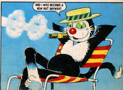
Over on the Phil-Comics Facebook page there's an item I'd never seen before. Presumably this is the original mock up of the cover to The Dandy Summer Special 1968 with art by Charlie Grigg. As you can see, it depicts a rather more unpleasant looking Korky the Cat than we're accustomed to! I'm surprised it even reached the completed stage.
Perhaps considered inappropriate for the cover, it was never used and Charlie was asked to redraw it. Here's the published version. A definite improvement I think!
 |
| Copyright D.C. Thomson & Co. Ltd. |
 |
| Copyright D.C. Thomson & Co. Ltd. |
https://www.facebook.com/pages/phil-comics-auctions/156116677784593
You can also visit the Phil-Comics website to follow the latest comics auctions:
http://www.phil-comics.com/
Phil Shrimpton has written an article about his collecting over at the Rareburg site here:
https://www.rareburg.com/article/collecting-dandy-and-beano-comics
My thanks to Peter Gray for giving me the heads up on this rare Dandy artifact. You can visit Peter's blog on British comics here:
http://petergraycartoonsandcomics.blogspot.co.uk/

7 comments:
Not surprised it was rejected, Korky looks stoned in the first version !
I just love such things! I've got pictures of Bill Ritchie's first versions of two Sparky annual covers and will show them on my blog at some point.
I knew you would flip out in a funny way when you saw this thanks for the links and to my blog..
Its almost like a student drug t shirt which someone had made up... :)
It's such a strange image of Korky that I had wondered if it was a private commission done AFTER the published version, but I'll take Phil's word for it that it precedes the published cover.
Perhaps Korky is supposed to look sleepy or about have a nap, but just comes across as sleazy. Though I'm also more inclined to think that it was private, and never actually intended for publication.
Yeah, the more I look at it I'm wondering that too. A few things about it bother me. For a start, covers to specials and annuals would be approved at a rough sketch stage. Not only has this reached completed art stage but it's also had the logo and price added. Surely the rejection would have happened long before that? Also, the submitted art would have a white border, margin notes and crop marks.
The other thing is the style looks more like Charlie's later work, when he was drawing seaside postcards.
I could be mistaken, but... I dunno. What do others think?
Hi Lew...Yes the Korky "cover" looks like a spoof to me .It would have worked really well in an underground comic setting.It was probably done as a laugh although it is really well finished. I can't imagine it ever being considered for children though. It is funny how the smoking reference would be totally expunged for today's tastes. We have to protect the little dears at all costs now.
Post a Comment