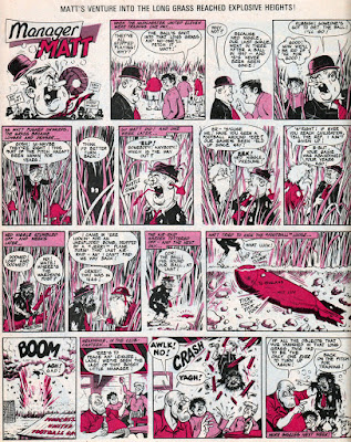
Manager Matt was Ken Reid's third humour series for football weekly Scorcher, following the runs of his previous strips Sub and Football Forum. It began in Scorcher dated 23rd January 1971 and concluded in the issue dated 7th August 1971.
In typically funny Ken Reid fashion, the strip featured numerous consequences leading to brilliantly rendered comic violence. Manager Matt himself was a somewhat unusual, and more cartoonish, design for a Ken Reid character, with his head and body out of proportion to his limbs. Ken's characters usually had fairly normal proportions, so I'm wondering if the artist was perhaps following a design by the art editor? In any case, it made no difference to the stories which for the most part were as funny as any of Ken's great works.
Here's a selection of strips from that 29 week run. Click on each page to see it larger.
Here's a cross-reference of all the other series that Ken Reid did for Scorcher. Have fun!
SUB (1970:
FOOTBALL FORUM (1970/71):
MANAGER MATT (1971):
HUGH FOWLER (1971/72):
THE SOCCERNAUTS (1972):
HARRY HAMMERTOE THE SOCCER SPOOK (1972/73):
JIMMY JINX (1973/74):
TRIPTOE TRIERS (1974):


5 comments:
nice stuff. I never bother with Football comics before I just have no interest in the subject, but often they did have some good 'related' strips like this.
interesting to see that reguardless of how designed Matt, by the end, the Character Proportions turned into what you more expect from Ken Reid. Though I would say it's almost a given that any such strip would have the characters changing over time.. It's NOT laziness really, but Character designs often become simpler over time too. Makes sense.
I think i's mostly tweaking via natural flow to a design my comfortable with. I also think it's a good sign as an artist can draw a character in his style without it going 'off model'. I think Style isn't a model factor at times, BUT some artists can do things in such a way as you cannot even really tell it's that character. You often put your own style twists on various characters in your Beano strips, but they are still clear how they are with all the noted features.
Dennis the Menace is a good example.. a lot of artists, a lot of style, a number of tweaks in design but it's mostly kept him recognisable.. though I think some of Davy Laws design had, at times, become a bit .. interesting.. not bad but didn't suit the character, probably why a big shift backwards. I personally I loved Mike Pearse's take on the character.
You're right. The designs of characters often change over time, as the artist finds a more comfortable way of drawing them or their style naturally evolves. A good editor understands this, and most readers either don't notice the gradual changes or they don't mind. Even Desperate Dan looked different from Dudley Watkins' early strips to how he was years later by the same artist. Dennis, as you mention, is a good case in point, with him becoming very elongated at one stage in the fifties. The Bash Street Kids changed quite a bit during the fifties too, as Leo Baxendale experimented with his style and developed as an artist.
Scorcher was a great comic although I initially bought it only because I saw Ken Reids art in one of the promos of the comic (Sub) - I have tried to get at least one of all of Reids strips from the mid 60s onwards (got loads of some of course) but The "Triptoe Triers"from Scorcher still alludes me :(
I have the full series of Scorcher comics (except for one issue) so I'll get around to that strip eventually Psul.
Sorry for the typo Paul.
Post a Comment