This week's issue of The Dandy sees Kid Cops return for a third series. The title and concept was created by the Dandy editorial for the 2010 relaunch and I developed it further, designing the characters and writing and drawing the strip.
Kid Cops are Sgt.Nick and Officer Bobby who bring their own brand of law and justice to the streets of Dandytown, usually to thwart crazy extremes of Health and Safety.
 Kid Cops replaces Postman Prat which has just ended its second series. The Dandy is on sale Wednesdays, 36 full colour pages for £1.99.
Difficulty finding it in your area? Subscribe to The Dandy here:
http://www.dcthomsonshop.co.uk/Group-Dandy.aspx
Update 1/2/2012: I notice a certain critic (the usual one) has been indulging in at least three posts of lengthy Dandy-bashing over on his blog the past few days. That is his right of course, and no one could or should deny him his opinions, repetitive as they are. (Although to say that today's artists attained their position through luck or bad editorship is either sour grapes or ignorance.) I do however wish he'd realize that his views are clouded by his nostalgia of an era long gone. And by nostalgia I don't just mean a preference for the particular issues of comics one once read, but for a rose-tinted ideal of the past, including comics from before one's time.
It's only natural that one would prefer the comics of one's childhood, but consider the fate of Classics from the Comics. 64 packed pages of some of the best strips DC Thomson ever published from the 1950s to 1980s in a cheap, affordable format, but sadly it couldn't sustain enough of a modern audience to make it viable any more.
When you're older there's a reason why the modern world may not be appealing as that of bygone days. It's simply the generation gap. Time moves on, and the style of comics changes as it always has. My Grandad thought Whizzer and Chips of 1969 "wasn't as good" as Illustrated Chips that he read in 1900. Back in the 1980s I remember thinking that some comics of the Eighties were not as good as those of the past. But I wasn't viewing them through a child's eyes. Hopefully I know better now. These days I meet 30-somethings who grew up on those comics in the 1980s and they think they were wonderful. Likewise, today's young readers will no doubt have the same affection in 20 or 30 years time for the comics they grew up with, such as The Dandy of 2012.
The critic can quite comfortably predict that The Dandy will eventually fail of course. Every British comic launched in the 20th Century has folded, with a handful of exceptions. It's like predicting someone will eventually die. Nothing lasts forever, so whenever The Dandy, Beano, 2000AD, etc finally fade away the critic can crow "I told you so. They should have listened to me! Yes, me! Over here! Notice me dammit!", whilst ignoring the fact that all the comics of his past that he holds up as templates for success have long since perished, despite many of them being undeniably brilliant.
The Dandy and other such comics are, as they've always been, aimed at children. If adults get some fun out of them too then that's a bonus. But those few adults who resent modern comics for not being like they used to be? They really need to move on and just enjoy the comics they do like.
 Brilliant cartoonist and writer Jamie Smart has unleashed some wise words from out of his brain over on his blog. If you want to do comics, it's worthwhile reading what Jamie has to say about what you can expect when your work is published (or even self-published). Here's an extract: "If you want to draw comics well, you need an intelligence behind you, a certain level of awareness. When you’re at school, learning irrelevant minutiae does seem pointless, but when you leave you realise it was all to raise your general smarts."
Having experienced some nasty online abuse himself, Jamie has some words to say about "fans" who do little but bitch about things they don't like: "most will just move on and find something else they enjoy instead. The rest, the tiny proportional slither left, the very few who’ve seen your work, and dislike it, and don’t want to move on, THEY will comment on it, because they seem to believe their opinion is very important. And they, are stupid. Because art, by its very nature, is subjective.It would be impossible to create art everyone enjoys, and why would you want to?"All interesting stuff, with some commonsense advice for people starting out in comics. To read it all, visit http://www.fumboo.com/blog/everythingexciting/
 Only three issues in and already Strip Magazine feels like an old friend one looks forward to re-acquainting with every month. There's a few surprises this time too, with the debut of two new stories. First off, the European serial The Devil's Heritage kicks off with a 10 page first chapter. Set in 1938 this intriguing thriller is written by Jerome Felix and nicely illustrated by Paul Gastine. I'm already hooked and eager to know what happens next.
 The other new strip is Bogey-Man Bob, also from an international source, taking up the back cover. This should appeal to old fans of Frankie Stein (and to new readers) and features attractive cartoon work by Gerard Leever.
 Sadly, Recovery Inc. isn't in this issue, and further chapters have been postponed until later in the year. I suspect its absence may annoy some readers but The Devil's Heritage is an excellent replacement.
There's another six pages of Warpaint by Phil Hester and John McCrea, with the story developing well. It manages to strike a good balance between being a fast paced action strip and something deeper, which isn't always an easy feat to pull off.
Black Ops Extreme this issue is a self-contained flashback episode written by John Freeman as ever and drawn by guest artist Nick Dyer. In tone, this is probably the closest strip in the comic to IPC's Action, albeit with a modern approach. Well, if we discount the Hook Jaw reprint of course. Speaking of which, the body count continues to rise as the great white shark claims more victims.
Age of Heroes continues, by James Hudnall and John Ridgway, with the luxury of 11 pages. I only recently became aware that this originally appeared in an Image Comic series in the 1990s but I'm sure that, like for me, it'll be new for many readers. Indeed, it's still fresh and worthwhile even if one has read it before as John Ridgway is colouring his artwork for Strip Magazine. (I understand it was in black and white in the original printing.) This issue also includes an interview with John where he mentions continuing the series beyond its original chapters.
The aforementioned Nick Dyer also illustrates another strip in this issue in the form of Black Dragon, written by Richmond Clements. The character will return at a later date in an ongoing series.
 Another couple of features include an interview with writer and artist Jason Cobley and an article on IPC's fondly remembered Starlord comic.
At present, unless you subscribe, Strip Magazine is still only available to buy from comic specialist shops. Issue 3 should be available now, although I know of at least one Forbidden Planet that still hasn't had their copies from the distributor. Hopefully that will be rectified this Wednesday if not before.
I know that some people think that the comic should have been available in newsagents from the outset but sadly in this day and age that isn't practical for new publications without the sort of budgets that big companies can afford. Print Media Productions are doing this right; starting small and building up. While some people do little but complain about the state of comics, John Freeman and the contributors of Strip Magazine are out there doing something about it. I know who gets my respect.
Strip Magazine continues to develop nicely and is a great bargain at 68 pages for just £2.99. (Most US comics cost that just for 20 pages of story.) It's well worth your support.
http://stripcomicmagazineuk.blogspot.com/
 I recently reviewed the new book The Pictorial Guide to British 1950s Sci-Fi & Horror Comic Books which is an informative showcase of hundreds of covers from that era but if you want to know what the actual stories were like Great British Fantasy Comic Book Heroes is an excellent companion volume.
Published by Ugly Duckling Press Great British Fantasy Comic Book Heroes is a hefty tome; a large format hardback containing 464 black and white pages of originated British hero strips from UK independent comics of the 1940s and 1950s. The compilation has been assembled by Phil Clarke and Mike Higgs (Mike also drew the cover) and is a wonderful compendium of characters long forgotten. For those of you who have wished for a collection of old British strips, this is ideal.
 The book kicks off with a 10 page introduction detailing the circumstances which gave birth to these comics. It tells of how paper rationing during and after World War 2 imposed restrictions on established publishers but newcomers were exempt from the paper quota restrictions and were able to turn out titles on any paper available to them. By 1945 the government had also restricted the publication of new comics but the small publishers got around this by slightly changing the titles of their comics so they appeared like new titles to eager readers. Thirsty for American comics that were no longer being imported into the UK due to the war, kids lapped up the British reprints and home-grown superheroes. The article then moves on to focus on individual characters, adding more background to the strips selected and, where known, naming the creators involved.
 Considering that many of these comics suffered from cheap printing, Mike Higgs has done a splendid job on restoration for this book. The fact that the strips appear considerably larger than their original published size is also very welcome. There's certainly a lot packed into the book as those old strips usually only ran to a few pages. The tone of the stories is certainly cheesy but that's all part of their charm. Collectors will be particularly interested in the early work of people such as Joe Colquhoun, Denis Gifford, Ron Turner and Denis McLoughlin.
 Some of the British superheroes were clearly knock-offs of American characters. Marvelman (who is represented by a couple of strips in the book) is the well known one but there were others even more blatant such as Mr.Apollo whose costume was virtually identical to the one worn by Captain Marvel. However that only adds to the curiosity value of the strips in my opinion. It's good to see humour strips represented too, such as the distinctive work of Harry Banger on Stoogie the Super-Man...
 One artist who I think was a great loss to the industry when he quit comics was Bob Monkhouse. One can't blame Bob for one moment for following his fortunes elsewhere but his artwork is definitely worth a look. This book collects one of his complete Tornado strips from Oh Boy! Comics, notorious for its phallic alien designs. How Bob got away with that remains a mystery to this day...
 Many of the stories are lightweight in nature, with the heroes thwarting crooks or fighting alien menaces, so it came as a surprise to see one strip dealing with social issues. In Mick Anglo's Captain Miracle story Way Down South, the heroes battle the Ku Klux Klan in a tale opposing racism. Unfortunately the way the heroes go about it is a bit embarrassing today (they black up to lure out the racists) but its heart is in the right place.
 Now for the price of the book. At £75 it's not cheap, however you have to bear in mind that this is a very limited collectors edition. Only 100 copies have been produced, making this a very scarce item indeed. (Considering that the Marvel Masterworks, with higher print runs, cost around £40 for around 280 pages the price of this book doesn't sound so bad.) You also get a free gift, - a randomly selected genuine 1950s independent comic. (I got Merry Maker No.3.)
You're unlikely to find this book in any bookshops due to its rarity but you can buy it directly from Blasé Books at £75 post free (UK only).
Send a cheque for £75 sterling payable to Blasé Books at:
BLASÉ BOOKS,
Hazelwood,
Birchfield Road,
Redditch
B97 6PU
United Kingdom
Alternatively you can order it via PayPal. £75 to blasebooks@aol.com
Please note: The post free price is only for UK customers. If you live outside the UK please e-mail Blasé Books at the aforementioned address for postage costs to your country.
 Here are the details for the latest four Commando comics that are in the shops now, priced £1.50 each. Thanks again to editor Calum Laird for providing the info...
Commando No 4463: The Improbable Mission
Second-Lieutenant Clement Cleveley of the Army Educational corps was a real boffin. A research student before the war, his mathematical speciality was probability theory…which didn’t really fit with anything in service life.
As it turned out, that wasn’t quite the case which was how, instead of peacefully working at a classroom blackboard, Clement ended up charging around the desert dodging bullets with a bunch of crack SAS men.
Script: Alan Hebden
Art: Manuel Benet
Cover: Manuel Benet
 Commando 4464: Night And Fog
In Occupied Europe during the Second World War, dawn raids and midnight arrests became regular occurrences. They were feared by all the occupied peoples but soon they began to lose their ability to invoke terror.
That’s when an evil Nazi scientist decided that it wasn’t enough just to arrest people. He wanted to make them disappear into the…
Night and Fog
Script: Alan Hebden
Art: Morahin
Cover: Janek Matysiak (Not Ian Kennedy as it says in the credits grenade!)
 Commando 4465: Terror Zone
It started as a routine training patrol to test five top Aussie recruits — until their radio packed in and their NCO was killed in an accident.
Then the dense New Guinea jungle became a terror zone as a bullet flew from out of the shadows. Someone — or something — was trying to kill them…but there wasn’t supposed to be an enemy for thousands of miles!
Introduction by Calum Laird, Commando Editor
Commando fans have always held Carlos Pino’s artwork in high regard, and rightly so. Here he brings the clammy jungle and a band of dishevelled Japanese to life in a few strokes of the pen and brush.
He’s giving form to a story by another long-serving Commando regular, Mike Knowles, whose plots have entertained for long enough to earn him a long-service medal and a well-deserved retirement.
Phil Gascoine did a limited number of Commando covers, but every one was a little gem — even when he had to show an all but invisible figure in the background.
Terror Zone, originally Commando No 2673 (June 1993)
Script: Mike Knowles
Art: Carlos Pino
Cover: Phil Gascoine
 Commando 4466: The Lion’s Den
…that’s where safe-cracker turned secret agent Danny Gregg was headed, to wrest secrets from deep within a Nazi lair.
And he had to succeed. For Danny the reward would be a pardon from his criminal past. For Britain it could mean the difference between victory and defeat!
Introduction by Calum Laird, Commando Editor
At the heart of every Commando story is just that, the story. And here Bernard Gregg, who wrote almost 100 Commando tales between 1972 and 1999, weaves a cracking plot. He takes the “safecracker given the chance to go straight” idea and gives it a fresh twist…or two.
He’s ably complemented by artist Janek Matysiak whose detailed artwork and envelope-pushing layouts really bring things to life. Nearly 20 years later, Janek’s still working for Commando doing covers, but this black and white work is up there with the best of them.
The Lions Den, originally Commando No 2632 (January 1993)
Script: Bernard Gregg
Art: Janek Matysiak
Cover: Janek Matysiak
Visit the website at: http://www.commandocomics.com
 If you thought that reprints of American comics began in Britain with Marvel UK in 1972, or even Odhams and Alan Class in the 1960s, this book will be a revelation. The Pictorial Guide to British 1950s Sci-Fi & Horror Comic Books is a chunky 288 page full colour softback on quality paper compiled by comic historian Mike Morley.
 Here you'll find information on numerous UK comic books of 60 years ago including Captain Marvel, Race for the Moon, The Human Torch, Adventures into the Unknown and many more, some very rare or even forgotten.
 There were dozens of different titles and not all of them contained American reprint. Many were home grown British comics too, such as the Tit-Bits Science Fiction Comics with fantastic artwork by Ron Turner.
 The book contains hundreds of sharply reproduced covers (and some interior pages) showing the sheer scale of the output of comics back then. Traditional British comics and story papers are also mentioned, when they fit the book's remit, such as Comet, Adventure, and Lion.
 Marcus Morris may have created Eagle as an antidote to comics such as this but, as people who were kids back then will tell you, readers often didn't choose between Eagle or horror comics, - they bought both! Sadly, many of these comics were short lived, when, as the author tells us, the witch-hunt against comics in the UK spearheaded by the National Union of Teachers put such comics out of business as publishers feared prosecution if they continued. Dark times indeed.
 This book is a valuable asset for anyone genuinely interested in the history of comics. It covers a fascinating area of publishing that has often been overlooked so it's good to fill in the gaps in one's knowledge with something like this. Author Mike Morley keeps his writing tight and sticks to the facts, providing solid information without bogging it down with conjecture or dull story synopsis. The design of the book, by Mike Higgs, is also straightforward and clear, and packs a lot in for your money.
 The Pictorial Guide to British 1950s Sci-Fi & Horror Comic Books can be obtained post free in the UK by sending a cheque in Sterling for £14.95 payable to Blasé Books at:
BLASÉ BOOKS,
Hazelwood,
Birchfield Road,
Redditch
B97 6PU
United Kingdom
Alternatively you can order it via PayPal, also for £14.95 (Sterling) to blasebooks@aol.com
Please note that this post free price only applies to orders in the UK. If you live outside of the UK and want a copy please e-mail Blasé Books at the aforementioned e-mail address and they'll tell you how much postage will cost to ship the book to you.
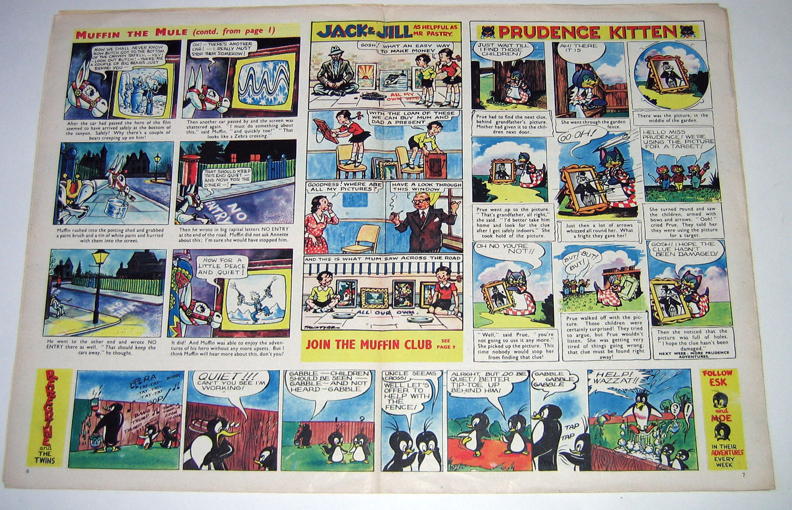
 This is the issue of TV Comic that would have been on sale exactly 60 years ago this week. Those of you who knew the title in its later years will immediately notice that in its early days (this is issue No.12) TV Comic was pitched at a younger readership, perhaps just above the nursery comics age group.
Published by News of the World Ltd (long before that paper dragged itself into the gutter towards oblivion) the early TV Comic only had 12 pages, but 8 were in glorious full colour thanks to the slick photogravure printing. Even in the early 1950s, such lavish production standards were rare, reserved for such comics as Eagle and Mickey Mouse Weekly, whilst the majority such as Chips, Beano, Film Fun, Knockout etc had to settle for common newsprint and limited colour.
As you can see, the cover strip in 1952 was the hugely popular Muffin the Mule, based on the puppet that the nation's children had taken to their hearts. (These old comics offer a fantastic snapshot into history. Just look at that 1950s TV set!)
The artwork on Muffin the Mule was by Neville Main, who would become a regular on TV Comic, later illustrating the Hartnell Doctor Who strips and other features. The Muffin cover strip continued on the centre pages alongside strips by other artists.
 Mr.Pastry appeared on page 2 of TV Comic back then. (Pastry was a comedy performer, - real name Richard Hearne, - in case you were assuming he was a TV chef.) The artwork is by Lunt Roberts (according to Denis Gifford's Encyclopedia of Comic Characters), providing a nice bit of slapstick sequential art here.
 There were also text stories and articles in TV Comic back then, such as this activity feature. No snickering at the back there please...
 This Tusker & Tikki strip has some very nifty artwork by someone calling himself "Spike".
 With 8 pages of colour you'd have thought they'd have reserved one for Prince Valiant as they were reprinting the American Sunday pages. Sadly not, and Hal Foster's top quality work was reproduced in murky black and white instead, with an instruction for "young artists" to colour it themselves. (Luckily I managed to pluck this issue from the time vortex before any 1950s freckle-faced urchins with compulsory sticking-out ears had crayoned on it.)
 The Tom Puss strip opposite Prince Valiant is another reprint, this time of the Dutch strip Tom Poes by Marten Toonder. I assume this is a chapter of a longer story that was serializing one of the Tom Poes albums.
On the back page was Hank which, like Muffin the Mule, was also based on a puppet series. The lively artwork was by Ron Murdoch.
 For better or worse TV Comic underwent several changes over the years but this early issue shows what a quality product it was in its early stages. Even its logo was clearly designed and contemporary for its time, and the whole comic must have seemed very modern and exciting compared to most comics of the 1950s. Also, with television being in black and white back then imagine the impact the stunning colours of the TV Comic strips must have had on the readers.
A year later in 1953, Amalgamated Press launched a rival in the form of TV Fun, which had charms of its own but failed to last beyond 1959. In the meantime TV Comic continued its steady progress and managed an impressive run of 33 years, ending in 1984.
 The second issue of The Phoenix arrived this morning, surprisingly a day earlier than scheduled. From its striking cover by cartoon genius Jamie Smart to its final page it's once again packed with some of the best artwork and stories seen in modern British comics. Good to see Gary Northfield (creator of Derek the Sheep) join the team with his new strip, Gary's Garden.
The comic looks and reads great and deserves to be a big hit. Shame then that there have been some glitches in distribution. The deal was for The Phoenix to be sold in the Waitrose chain of stores beginning with No.1. Unfortunately, according to feedback so far, it's not in any of those shops!
Secondly, some people who subscribed this week, and were told that their subscription would begin with issue 1, have discovered that it begins with No.2 instead. Why this should be so is uncertain. Surely the print run of issue 1 hasn't sold out already?
The good news is that the staff at The Phoenix are now aware of the problems and are working to rectify them. I sincerely hope they can, and quickly, because such a good comic does not deserve to be hampered like this. One of the things that damaged The DFC, in my experience, were problems in the subscription department. Missing issues caused myself and others to give up subscribing in the end. I wouldn't like to see that happen again with The Phoenix.
Members of Comics UK have been discussing their experiences with The Phoenix on the Comics UK Forum. Click here to follow developments. (Note: the member using the alias "Phoenix" has been using that handle for years and is not connected to the comic. Just thought I'd mention that to avoid any possible confusion.)
At time of writing, the problems still haven't been mentioned on The Phoenix website. Hopefully things will be made clear for readers soon in order to save any more wasted journeys to Waitrose for potential new readers:
https://www.thephoenixcomic.co.uk/news/
 It's no problem for superheroes to multitask and from this week Bananaman will be appearing in both The Dandy and The Beano.
When news leaked out recently that Bananaman was to start appearing in The Beano, rumours started flying like wildfire, with fans some claiming he'd "defected" and others seeing it as a sign The Dandy was winding down. As it happens, such unfounded speculation was a waste of pixels as the character is now appearing in both comics. Brand new Bananaman strips continue to run in The Dandy, drawn in a modern style by Wayne Thomson, whilst classic reprints by John Geering now appear in The Beano.
Won't the differences in art styles on the same character confuse some readers? Possibly, or they might even think it's cool. Thing is, with the 1980s Bananaman cartoon series on DVD and other "Classic Bananaman" merchandise available perhaps DC Thomson felt the character needed more exposure in comics. Going back to the classic look wouldn't really suit the modern Dandy so putting the reprints in The Beano makes sense. It can't hurt that the Beano reprints mention that "Bananaman also appears every week in The Dandy".
So there you have it. A choice of 'Nana styles to read or you can enjoy both on their own merits. The latest issues of The Beano and The Dandy (shown above) are in the shops today.
 As some of you know, Tom Thug (The Brainless Bully) was a strip I created that appeared throughout the run of Oink! in 1986-88 and then transferred to Buster for many years.
What you may not know is that a Tom Thug strip once appeared in Whizzer and Chips as well. In fact I'd forgotten about it myself until I chanced upon this issue whilst looking for something else.
Oink! was always an alternative style comic compared to the rest of IPC's publications but with its sales faltering in early 1988 the intention was to try and attract some new readers to the comic. Tom Thug was always quite popular, and with him probably being the closest to the type of character seen in the traditional comics I was asked to create a new half page strip advertising Oink! that would appear in Whizzer and Chips.
Having never worked for IPC's flagship humour title before then I thought this would be a perfect opportunity to have Tom Thug meet the legendary Sid (of Sid's Snake fame) and Shiner (Chips' lead character), and throw in Odd-Ball (a childhood favourite) as well. Here's the result...
 I might be mistaken but I think this is probably the first time a story in an IPC humour comic continued into another title, excluding mergers.
I believe the promotional strip helped Oink's fortunes a little bit, but as Oink! was still being deliberately placed away from other children's comics in WH Smith there must have been numerous kids who just couldn't find it. Later that year, Oink! merged into Buster and I became a regular artist on that comic (working for Allen Cummings, a very good editor) but I never did any more strips for Whizzer and Chips, which folded itself a few years later. This then was my sole contribution to that long-running comic, but I'm still pleased to be a small part of its history.
(Incidentally, the cover artist of the issue as shown at the top of this post was Sid Burgon, drawing the long-running Joker strip.)
 Here's your chance to nominate your favourite comic, creator, website etc in the annual Eagle Awards, named after one of Britain's most famous comics. Introduced in 1976, the Eagles are the comics industry’s longest established awards. Acknowledged as the pre-eminent international prizes, they have been featured on the covers of leading US and UK titles across the last 30 years.
Some British comics and creators have been overlooked in previous years simply because the readers aren't aware that such awards exist, so if you feel your favourite strip/comic/artist/writer etc deserves to be listed just visit http://www.eagleawards.co.uk/nominations/ and do your stuff. If your favourite isn't already listed, scroll down the list until you reach "other" and add your own. Vote, vote, vote!

 Issue one of The Phoenix arrived bang on schedule this morning, thumping onto my doormat, and very welcome it was too.
It's an impressive debut issue (or second issue if we count Issue Zero as the premiere) with 32 full colour pages packed with brand new material from some of the finest UK creators. Neil Cameron's eye-catching cover opens the proceedings, giving us a taster of the lead strip he illustrates, The Pirates of Pangaea written by Daniel Hartwell.
 There's a good mix of styles in the comic, with no formula house style dominant. Jamie Smart has two pages, with his Bunny vs Monkey strip, and it lives up to his usual daftness. As Mister T might say, I pity the poor fools who don't "get" Jamie's work.
There's an aspect of The Phoenix that feels a bit like being at a posh kids' party in the 1950s, where people use phrases like "oodles" and "rip-roaring". It's not really dominant or problematic, but it's there. Perhaps it's why I felt the one scene of 'gross humour' in the comic clashed with the polite tone of the rest of The Phoenix. (Although showing a character covered in someone else's vomit would even be extreme in Toxic.) That's only a minor criticism and besides, what's a posh kids' party without someone throwing up?
There's a theme to many of the strips which is about characters finding themselves in unfamiliar surroundings, usually in a fantasy setting. This of course has been a successful plot device in classic children's books for decades (The Wizard of Oz, the Narnia books, etc.) and makes for a very welcome change from the usual suburban setting of children's comics. It also adds an unpredictable dreamlike quality to the stories, seen best in issue 1 with The Etherington Brothers' Long Gone Don.
 It's good to see a comic that enjoys being a comic, and The Phoenix contains a regular feature called How to make Awesome comics, again by Neil Cameron. This is a great way to educate kids on the creation of comics in a fun way, and hopefully inspire in them the same respect and understanding of the form that many European kids have.
The complete story this issue is The Golden Feather, a telling of the myth of the phoenix, by Ben Haggarty and Garen Ewing. Top class stuff.
 There's a nicely drawn half page illustration rounding off the issue by Chris Riddell entitled Supper at the Cat Restaurant. It's the kind of thing that could have appeared in comics of the 19th Century and is drawn with the illustrative skill of that era but with a modern twist. Excellent work.
All in all, The Phoenix No.1 deserves to be a huge success. It's intelligent, well crafted, entertaining, has its own style and, if today's kids can tear themselves away from their X-Boxes and mobile phones, I'm sure they'll find it to be great escapist fun.
At present, The Phoenix is only available to buy at Waitrose stores (and London's Tales on Moon Lane bookshop) or by subscription. Hopefully more retail outlets will follow but at present, if you're nowhere near a Waitrose, I'd encourage anyone to subscribe. (Depending on what option you choose, subscriptions range from as little as £10 for 5 issues to £99 for a year.)
https://www.thephoenixcomic.co.uk/subscribe/
Don't forget that there's a free 8 page preview of The Phoenix in today's edition of The Times!
 Britain's brand new, all-new children's weekly comic The Phoenix is scheduled to be delivered to subscribers tomorrow. It will also be available in all Waitrose stores and in the children's bookshop Tales on Moon Lane in London. Hopefully more retailers will begin stocking it soon. (My nearest Waitrose is miles away so I'm glad I subscribed!)
Tomorrow's edition of The Times (Saturday 7th Jan.) will have an 8 page pull-out promoting the new comic and the BBC are filming an item today for broadcast soon.
A review of issue 1 will appear on this blog shortly. Meanwhile, if you haven't subscribed already, now's your chance! https://www.thephoenixcomic.co.uk/
 Acting on information received direct from Commando HQ....
Commando 4459: Invasion Watch
In the early days of the Second World War, men too young, too old or too infirm for the regular services flocked to join Britain’s Home Guard to “do their bit.” Because of this, the units were dismissed as a bit of a joke in some quarters.
If those nay-sayers had listened to the conversation in one Home Guard headquarters on a night in 1940, though, they might have changed their minds. For as the men there shared their stories it became very clear that they had fought, and would fight again. And fight like the demons they were.
Invaders beware!
Script: Mac MacDonald
Art: Carlos Pino
Cover: Carlos Pino
 Commando 4460: Warriors!
Fighting men come in all shapes and sizes. They wear different uniforms and follow different flags. But the best of them share one quality. And that one quality marks them out from everyone else as men to be feared and respected in equal measure.
That’s the quality that marks them out as…
Warriors!
Script: Mac MacDonald
Art: Keith Page
Cover: Keith Page
 Commando 4461: Upside Down Ace
Alan Burnett and Colin Harvey flew as the crew of a Boulton Paul Defiant night fighter. They shared the same room and spent almost every second of every day with each other…yet the very air around them seemed to vibrate with the fierce hate they had for each other.
But, despite their bickering and brawling, they had the highest score of kills in the Group. How they kept it up was their own special secret…
Introduction by Calum Laird, Commando Editor
The Boulton Paul Defiant was one of many planes which didn’t quite live up to their designers’ hopes. But you’d never guess that from Ian Kennedy’s dynamic cover where, as only he can, he turns the world on its head to create another perfect composition.
Inside, John Ridgway — in only his second Commando outing —delivers an ideal complement to the cover, his crisp, accurate linework being perfect for aircraft illustration. Being a trained draughtsman is quite an asset.
The script, by Brunt, gives them him full rein to tell the Defiant’s story while at the same time touching on some of the super-secret “boffins’ war” that went on behind the action in the Second World War.
Upside Down Ace, originally Commando No 572 (August 1971), re-issued as No 1604 (May 1982)
Script: Brunt
Art: John Ridgway
Cover: Ian Kennedy
 Commando No 4462: Death Of A Wimpey
They found an abandoned plane in the desert, sand almost covering it. The paint was hanging off in shreds, the engines had seen better days and the fuselage was riddled with bullet holes. But it was still a Vickers Wellington bomber…one of the tough, famous Wimpeys. And it could fly — just.
So the men who found it, three army deserters and a no-good R.A.F. pilot, began to make plans to get back into the war — flying their own private bomber!
Introduction by Calum Laird, Commando Editor
At the end of October last year at the Dundee Comics Day, two men were honoured for their outstanding contribution to the comics artform. Though they are not related, they share the same surname and, as you can see from this book, they have both worked for Commando.
I’m talking, of course, about the two Kennedys, Cam and Ian who together have produced the art for this tale. Ian’s cover wonderfully captures a stricken Wellington bomber trying desperately to land, while the characterisation and movement Cam brings to the inside art is outstanding.
…And let’s not forget scriptwriter Ken Gentry without whose contribution this classic Commando story the two Kennedys would never have had the chance to showcase their talents so well.
By the way, I got to present the awards — how cool is that?
Death of A Wimpey, originally Commando No 469 (April 1970), re-issued as No 1335 (July 1979)
Script: Ken Gentry
Art: Cam Kennedy
Cover: Ian Kennedy
http://www.commandocomics.com