NOTE: Blimey! is no longer being updated. Please visit http://lewstringercomics.blogspot.com for the latest updates about my comics work.
Saturday, July 14, 2012
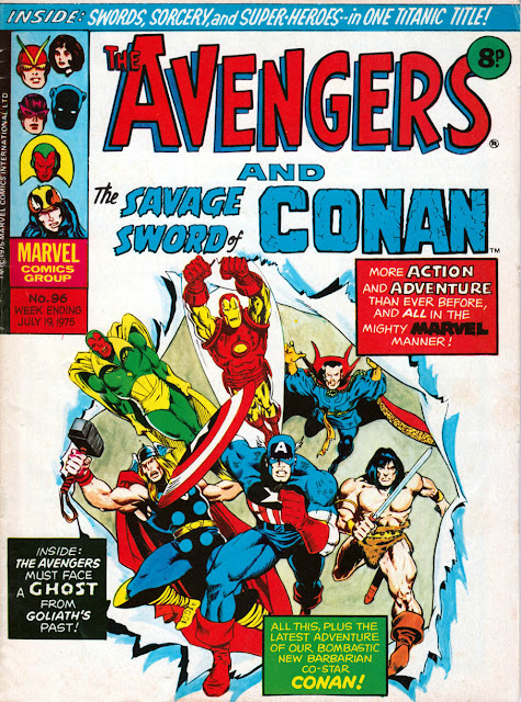
This week in 1975: Conan joins... The Avengers?!?
Two comics merging into one was a commonplace arrangement in the 1970s UK comic scene. Usually it was two similar titles, such as Lion and Thunder, or comics that complimented each other well such as Buster and Jet. One of the more unusual pairings was The Avengers and The Savage Sword of Conan which joined forces 37 years ago this week.
The Savage Sword of Conan had been launched by Marvel UK as one of their 36 page weeklies in early 1975. It failed to find an audience and after just 18 weeks needed to be merged into another title. One would have thought that Marvel UK's Planet of the Apes would have been a more likely home, but that comic was selling well and didn't need it. Presumably The Avengers comic was in need of a boost, so the stage was set and The Avengers and The Savage Sword of Conan became a reality. The cover even featured Conan the Barbarian running alongside The Avengers, in all-new artwork. (Not sure of the artist. Keith Pollard? Rick Hoberg? Pablo Marcos inks?) Conan wasn't actually part of the team in the stories though of course.
Admittedly The Avengers comic had previously shared its pages (and temporary cover billing) with Master of Kung Fu, but at least Shang Chi shared the same universe as The Avengers. Conan just seemed an odd fit.
This was of course in the days when Marvel UK comics had black and white interior pages. At least by this time they'd abandoned the heavy use of Letratone so the artwork could be seen clearly and sharply. This definitely benefited artists such as Gene Colan.
However, Barry Smith's work didn't fare as well. At least not in this issue, as much of Smith's fine line detail has been lost.
It's particularly evident in this page, where the battle scene is barely legible, but (UPDATE) as Phil Rushton explains in the comments below this post: "It's not entirely surprising that the B&W reproduction of the Conan story looks a bit unfinished. As I remember it the majority of the artwork for that particular issue got lost in the post, forcing Marvel to use a copy of Barry's uninked pages instead!"
Barry Smith's other work, reprinted from a Doctor Strange story in that same issue, fares better.
As you probably know, back then Marvel UK chopped up the strips into two or three part weekly serials so they could fit three or four different strips into one comic. This necessitated creating new splash pages for the start of some episodes. These pages, rarely credited, often featured some nice work and have never been reprinted anywhere since, as far as I know.
A Bullpen page in the comics that week explained how the merger was due to reader demand. An unlikely story, but even more shocking was the unnecessary apostrophe in the headline.
The back page featured an ad for the latest Marvel Treasury Edition imported from the USA. 100 pages of Barry Smith's Conan in full colour. One of the few Treasury Editions I've kept. And all for only 50p.
Subscribe to:
Post Comments (Atom)


7 comments:
It's not entirely surprising that the B&W reproduction of the Conan story looks a bit unfinished. As I remember it the majority of the artwork for that particular issue got lost in the post, forcing Marvel to use a copy of Barry's uninked pages instead!
- Phil Rushton
Ah that explains it. Thanks Phil. I'll amend the post with your info.
I had and loved that Marvel Treasury Edition of Conan - wish
I had kept it!
Peter Dunn
Hi Peter,
Good to hear from you.
I used to buy all those Treasury Editions although after a while their choice of reprint wasn't so special was it? I kept the Conan one, the first Holiday Grab Bag, 2001, Superman vs Spider-Man and that's about it.
Hi Lew,
I could never understand some publishers fetish with letratone. Okay , it was a step up from hatching and saved on an artists time when it came to shading etc ; but to me it always looked artificial and detracted from the art itself. Give me organic shading by brush or thumb any day of the week. It shows craftsmanship and a human touch.
The Cap.
Cap, Letratone or zipatone worked for some comics and not for others, the japanese manga industry would probably collaps without the trusty assistants laying down screentones for the mangaka.
Regarding Conan, he didn't have a lot of luck in finding a UK audience did he? In a recent clearout of old magazines I found a marvel UK issue 1 or a Conan comic from the late 80's, again with Barry Windsor-Smith art.
Then in the early 90's there was Havoc magazine which I think was an attempt to get into the anthology market again with 5/6 page chunks of strips like Robocop, Walt Simonson's StarSlammers and you guessed it, Conan with BWS art. Despite having some nice strips it was a fairly disparate lineup and if I recall rightly it only lasted a handful of issues.
Boy, I was seething when ruddy Conan showed up. Bad enough Shang-Chi nicked cover billing without some boring barbarian...
I remember even at the time readers were comparing about the awful Letratone, and Neil Tennant or whoever insisting that while we couldn't have full colour, the differing tones recalled colour. Yeah, right.
Post a Comment