

In the 1960s, comics publishers took it a stage further by actually printing entire comics in reverse to check everything looked ok! These "mirror comics" were never released to the public of course, and only a few copies of each issue were printed for editorial purposes. If anything looked wrong, the office art bodger would be instructed to put it right without delay as the deadline was looming!
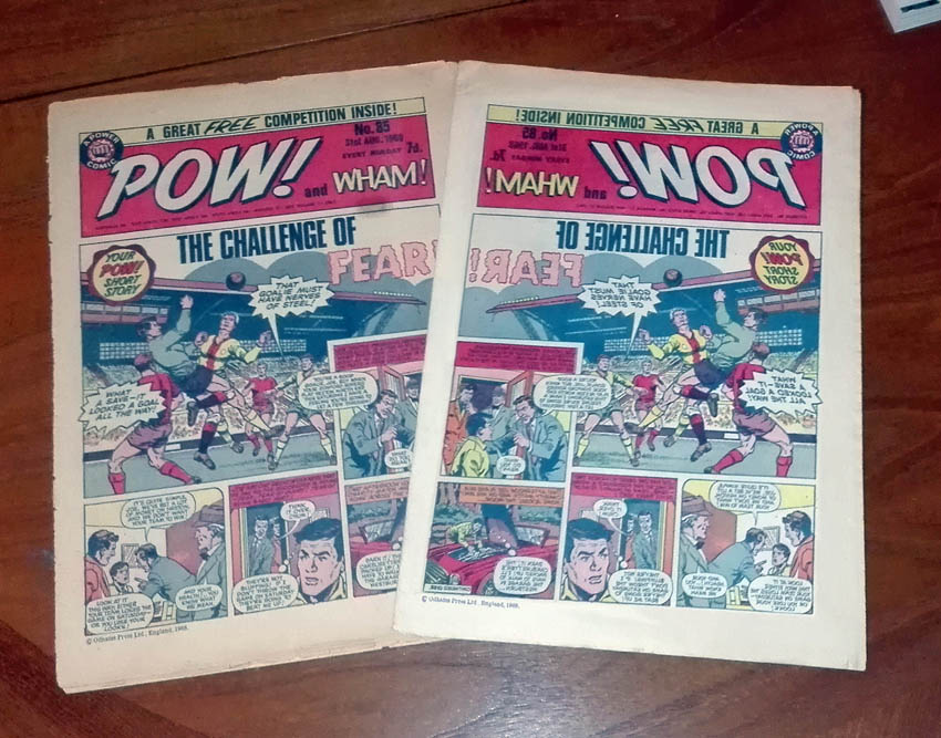 |
| The proper issue next to its "mirror" dopplelganger. |
Such "mirror comics" are actually rarer than Hen's teeth, and the only one in my possession is this issue of Pow! No.85 from 1968. This was the penultimate issue of the comic before it merged into Smash! so it was probably foolhardy of Odhams to waste the budget on a "mirror comic" but, well, it was the 1960s, a time of excess!
 |
| The centre pages of the Pow! "mirror comic" No.85. |
Ironically, Pow! used to feature Ripley's Believe It Or Not! cartoons, and this could fit into that same category. I understand that the practice of "mirror comics" was phased out in 1969 and no wonder. On reflection it was a nonsense idea!
 |
| Back page. Sammy Shrink by Terry Bave. |
17 comments:
I got that "fraud warning" again on the scan of the front page of "POW!" - or "!WOP" should I say. So much for artificial intelligence...
Seems to be a glitch with Blogger unless some idiot's been trolling and reporting pages unnecessarily. Just click the ignore button and carry on.
Firstly I believed it...:)
Well, it's quite true.
http://www.jachestudio.com/blog/artists-tip-2-use-a-mirror-to-see-your-mistakes
(you don't really need to look it up)
So not -actually- true [*] of mirror comics, but... quite true.
I wondered what "tip-1" was.
http://www.jachestudio.com/blog/artists-tip-1-flip-to-see-your-mistakes-so-you-can-fix-them
Specifically, look at the art upside down. Not you upside down. The art. And the model that you're drawing from. But not if it's a live model. Unless they're very agile, I suppose. And only minimally saggy.
[*] At least once in Marvel Comics reprints - it may have happened sufficiently often in the 1980s (I think) reprinting American stories that a page
...that a page went in upside down, that someone's job (someone you know??) was to check through and correct them - that's my deduction from the time they got caught out, when Conan the Barbarian in a story
...Conan the Barbarian in a story (I'm having trouble with my touchscreen keyboard) was captured by a tribe even more barbarian than him, and they did that thing of tying him hand and foot to a long pole so that two people could carry him back to the barbarian village. I think there's a similar scene in "Star Wars, Return of the Jedi". This meant that Conan was hanging upside down. But if the page was turned around then he would be the right way up - and so it was.
Nowadays they seem to put some pages in sideways, but on purpose. I think Rob Liefeld used to draw them that way, but now... well, it bugged me then, as well.
I haven't seen a page printed in the wrong colours for a long time, which with an actual Red Incredible Hulk and a Blue Marvel does seem to be a risk.
Which reminds me - BBC radio's "In Our Time" this week, podcast, was an interesting discussion of the artwork of Katsushika Hokusai (1760-1849), the father of manga (!) amongst other printed things.
http://www.bbc.co.uk/programmes/b08k1b0q
*waves*
Gotta be honest, it fooled me, Lew!
I've always thought that Garry Leach's cover to Spider-man Weekly 526 was published upside down. Can anyone put me out of my misery?
Aprils Fool anyone?
As most of you guessed, it was an April Fool. Thanks for playing along.
Well your article definitely got me. I even tried looking for "mirror comics" on the net (didn't have much success which should have been a clue).
Very nicely done, Lew. :)
Thanks, Sid, and thanks for taking it in the spirit it was intended.
I've done a few April Fool mock-ups over the years. Check out the 1st April posts for 2008, 2012, and 2014.
GREAT April fool - you got me, and this is much better than the silly stories in the national papers all day!
That was a clever prank, well played. This image almost looks convincing: https://4.bp.blogspot.com/-ujARnJ2a8sA/WN7Ep9pU-7I/AAAAAAAAcYI/jMZt48d9EmcLRJochMaOGIS1glnDz4woQCLcB/s1600/pows.jpg
I say almost, because if you look closely, you can see that the copyright label on the mirror comic isn't quite aligned to the artwork, whereas the one that's not mirrored is. I'm guessing you pasted a mirrored image of the real issue onto a different comic?
No, I pasted the copyright line onto the mirrored comic. It was a bit wonky because I was imitating the way layouts were in those days (which sometimes would be a bit wonky because they were done by hand).
I do actually have two copies of that issue. I photographed them side by side, then reversed the art on one and pasted it in. That's why there's a few little differences between them (eg: one having the residue of a sticker, and the other not being as yellowed).
Regarding the colour mix-up that some comics had, Robert, it's far less likely to happen these days because art files are sent to the printer via computer. It used to happen because the colour separations were done by hand and sometimes the printer would physically mix up the cyan and magenta overlays (for example), printing cyan as magenta and vice-versa. It'd be more difficult for that to happen with a Photoshop file.
Will, it does look that way. I think the cover was printed upside down because Garry hadn't left room for the logo at the top.
Post a Comment